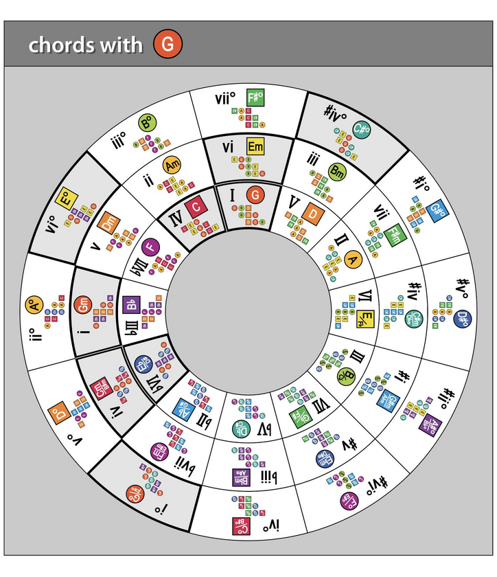
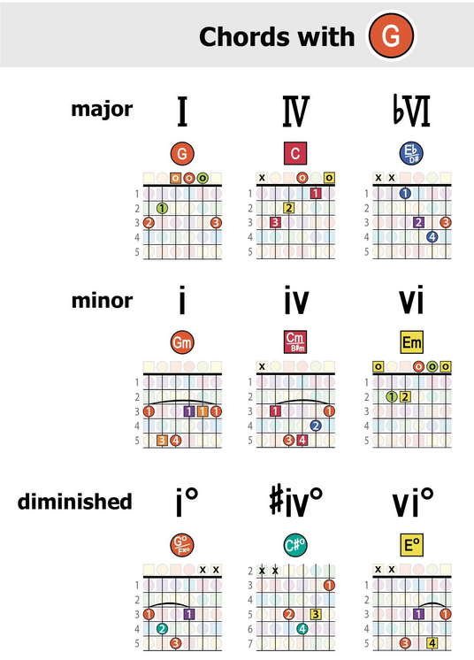
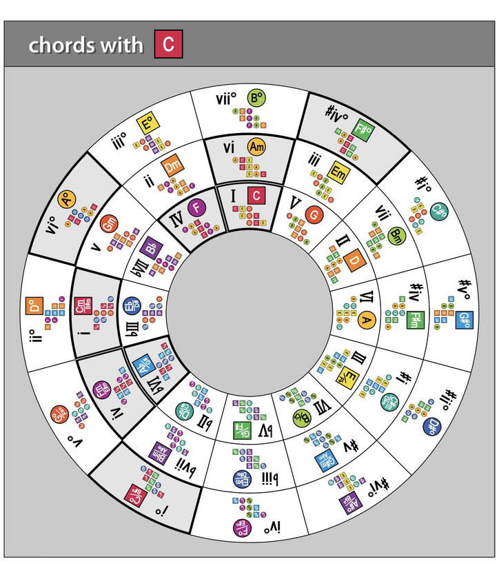
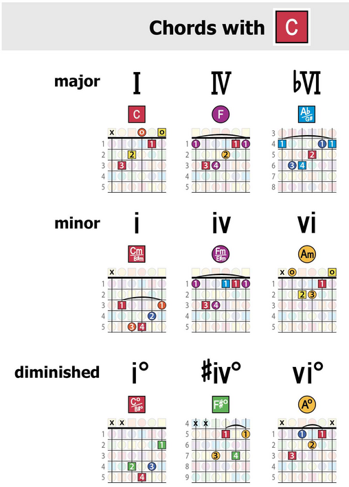
Music theory is NOT confusing ... but the SYMBOLS people typically use to understand it are.
In this video, we look at how to quickly understand the patterns of music using COLORS and SHAPES.
https://youtube.com/live/mSWUhD0wDiQ
In other posts here, I explain the benefit of color to see music theory. But people often ask, “… but what’s up with the shapes? Why also use these alternating squares and circles?”
So here’s a synopsis of why the shapes are so helpful, which summarizes key points in the video.
Traditionally, musicians try to picture the invisible patterns of sound using uniform black dots … along with letter and number symbols:
The result is a visually complex system of blotches and squiggles that’s confusing and even counterintuitive.
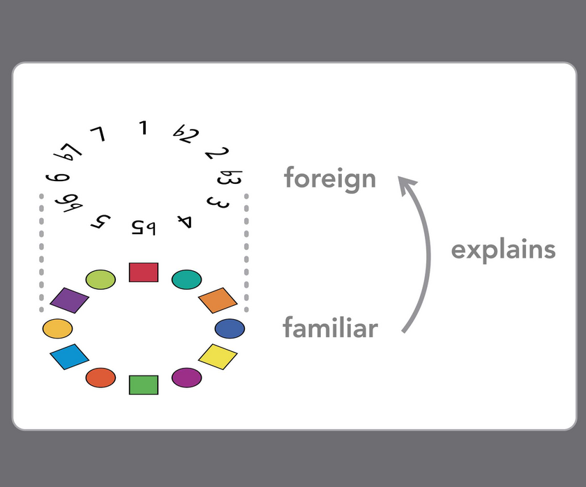
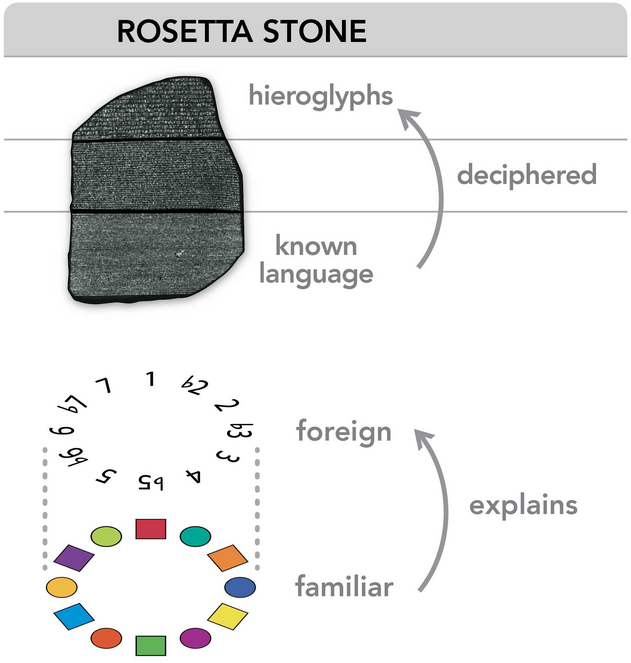
But when you get down to it, the two most fundamental labels used to communicate musical ideas is those letters and numbers.
- LETTERS that represent the 12 individual notes in music, and
- NUMBERS that indicate the different intervals between the notes
And together, these two symbol sets — letters and numbers — are meant to illustrate the musical relationships or patterns, which is what music is all about.
But while the letters do at least a decent job of distinguishing each note from the next — like C versus C# versus D, etc. — the colors visually clarify which notes are which more vividly and immediately.
And the color-note assignments here are based on applying the color wheel to the circle of fifths — where both patterns follow the exact same structure and sequence.
For example, in the center image below, the major scales of each key overlap in music to form the circle of fifths. And just as all the keys in music form this daisy-chain pattern, all the colors in the color wheel also bleed seamlessly into one another....